Emoji banners
March 2019 // github.com/danbernier/emoji-banner
Sometimes a prank opens up a possibility to do an old thing in a new way.
When I worked at TED, we chatted in Flowdock (it’s a now-discontinued chat product like Slack, but it was always less popular).
The team developed a peculiar appreciation for custom emoji, specifically for how nice they look. I think this was because Flowdock would let you control the size of the emoji (independent from the text), and for some reason the team had developed a culture of setting that slider to “very, very large”. The ugly parts of a custom emoji would be very apparent.
When you hover over a message, Flowdock would change its background color from white to gray, so an emoji with a white background would have a white box around it. Most of the team was able to make the background of an image transparent, but sometimes, through a lack of skill or a lack of patience, or maybe because they just didn’t think about the hover, someone would upload an emoji with a white background, and take some heat for it.
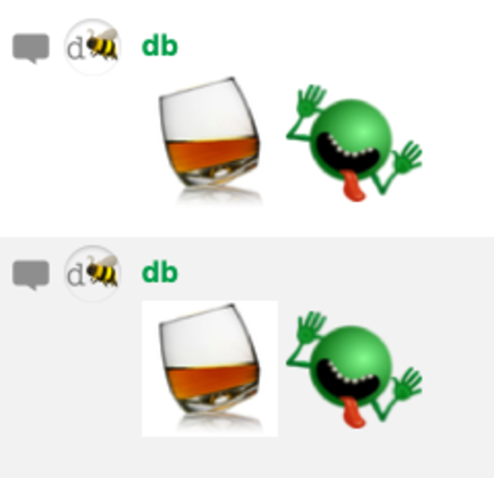
Like a meme or a fever, every few months people would argue about custom emoji with white backgrounds. In one of these outbreaks, some cheeky emojist made an invisible animated emoji of the party parrot that you could only see if you hovered over the message.

Somebody else took the idea one step further and made a :transparent: emoji that was just a 64x64 transparent image. Take that, emoji police! 🖕🚔

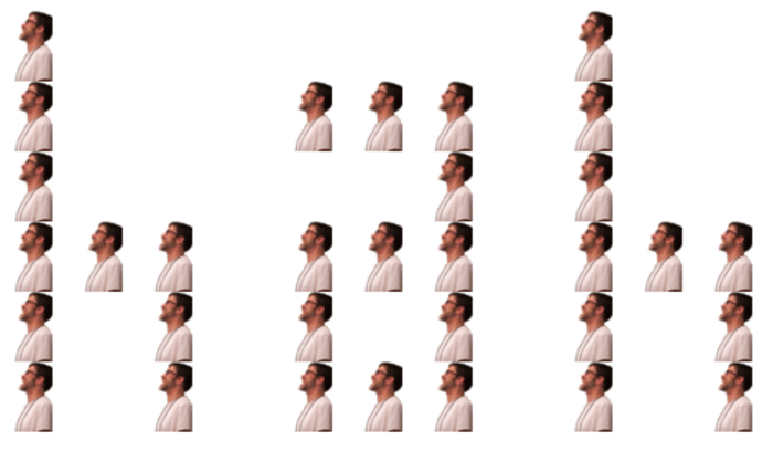
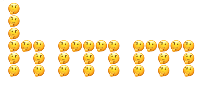
That last step opened up a new possibility: you could make a message entirely from emoji, but where each emoji was not its own image-word, but was a pixel in a grid of fixed-width emoji, spaced out with the :transparent: emoji:
:wave::transparent::transparent::transparent::transparent:
:wave::transparent::transparent::transparent::wave:
:wave::transparent::transparent::transparent::transparent:
:wave::wave::wave::transparent::wave:
:wave::transparent::wave::transparent::wave:
:wave::transparent::wave::transparent::wave:
:transparent::transparent::transparent::transparent::transparent:
:transparent::transparent::transparent::transparent::transparent:
…would render like this:


But no one’s going to do that by hand, so I wrote a ruby script to do it. The code is a mess, but running it is easy – here’s the command to produce that example:
dan@tower-of-babylon emoji-banner % ruby play.rb "hi" wave
The first argument, “hi”, is the message, and the emoji to render it in is the last argument.
The “font” was contributed by Tara Lynn Connelly, and I made some tweaks. Each glyph can be 7 “pixels” high, and is specified semi-visually, as an array of 7 ruby strings of any width (though all strings for each glyph must be of equal length); the renderer adds its own spacing and kerns the result. Here’s the code for “i” and “j”:
'i' => [
  'o',
  ' ',
  'o',
  'o',
  'o',
  ' ',
  ' '
],

'j' => [
  '  o',
  '   ',
  '  o',
  '  o',
  '  o',
  'o o',
  'ooo'
],
Gallery
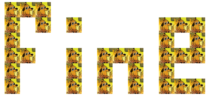
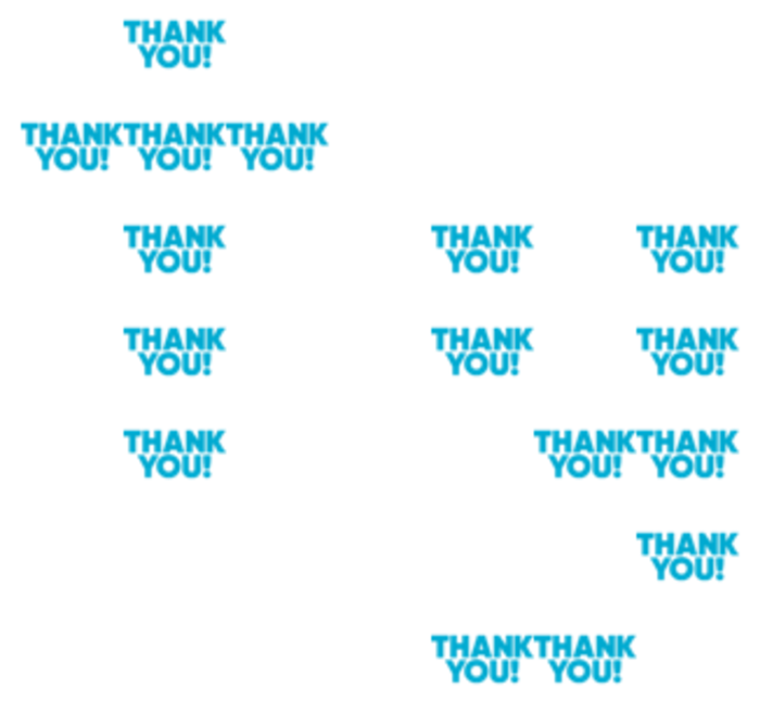
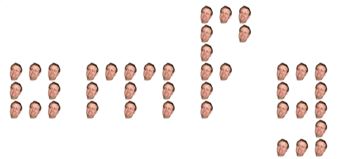
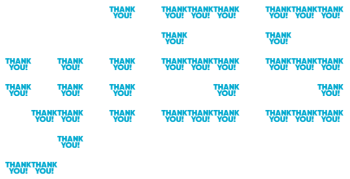
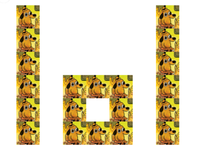
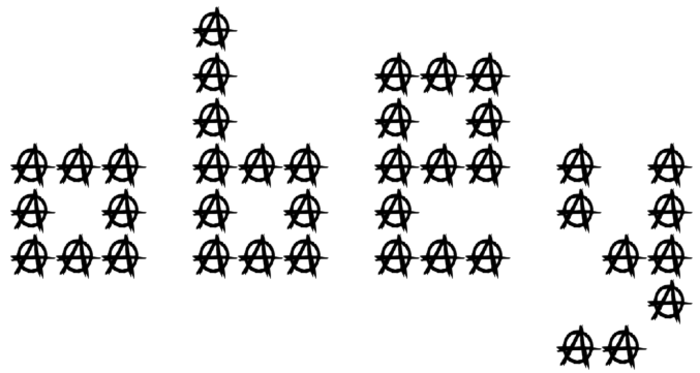
Even with a smaller emoji and a full-width message window, the banner’s text is constrained, and in the earliest experiments with it, the banner’s message was reinforced by the emoji.
But the two layers can diverge, carrying messages that inform and complement each other.
They can even carry different, contrasting messages.


As you might expect from a tool for creating message banners of emoji, a tool built for spectacle and volume, subtlety was a less common result.


(There was an undercurrent of anarchy and the ridiculous in the team’s culture that was wonderful for morale.)
Bugs in the source 🐞🐝🦟🕷🐛🐜
There were two difficulties with using the script in Flowdock.
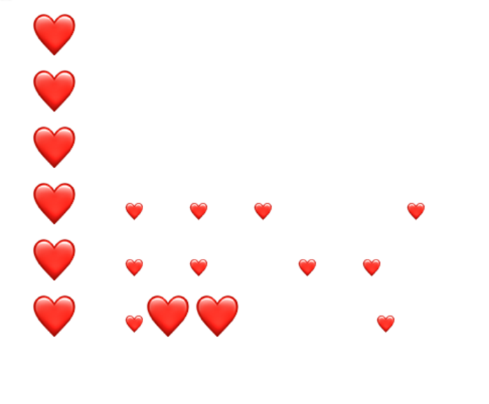
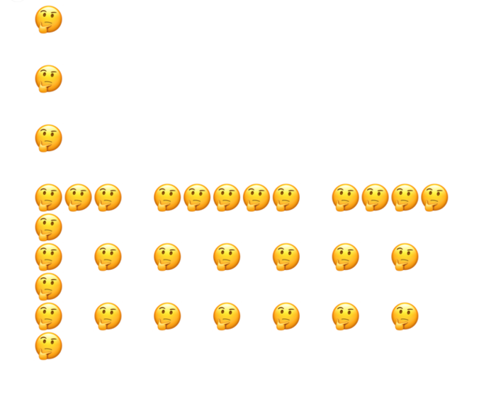
The first was a bug with how Flowdock would render native emoji: they wouldn’t all appear at the same size. Here, the message “luv” in ❤️ comes out lumpy and illegible:
The second was Flowdock’s “inbox” feature, which, like Slack’s threads, would put a subset of messages in a pane to the right, shrinking the main space and forcing more messages to wrap, making many of them illegible. Ironically, this was only aggravated when viewing the emoji at a large setting.
Next Steps
I’d like to port this to javascript and have a tool here so anyone can noise-pollute their professional chat, and pair it with simple instructions for adding a :transparent: emoji to your Slack. These messages will render on any chat platform you use, if it supports custom emoji with the :emoji-name: colon syntax.
The “font” lacks characters. Punctuation and numbers could add expressiveness to the messages. I’d like to make it easier to prepare a new font, add new glyphs, and even change fonts on the fly.
